Cover image created through Copilot
Have you ever struggled to understand Bayes’ Theorem? You’re not alone. I used to find the formal definitions and explanations of Bayes’ Theorem on Wikipedia confusing and hard to grasp. But after revisiting the basics of Venn Diagrams, everything suddenly became clear! Let me break down the complex formula into easy-to-digest parts using color coding and visual aids with Venn diagrams. Let’s dive in!
Previous readings
- 【How 2】Breaking Free! Use Docker to Create Hands-Off Interactive Broker TWS Managing Experience
- 【How 2】 Set Up Trading API Template In Python - Connecting My Trading Strategies To Interactive Brokers
- 【How 2】 Vol. 1. How 2 get all tradable tickers in US markets
What is Bayes’ Theorem?
We know that Bayes’s Theorem has many modern implications such as machine learning and artificial intelligence. Below is the definition extracted from Wikipedia:
Bayesian inference, a particular approach to statistical inference, where it is used to invert the probability of observations given a model configuration (i.e., the likelihood function) to obtain the probability of the model configuration given the observations (i.e., the posterior probability)…
Um…, this part of the definition has already killed half of my brain cells. As a non-math major, it took me a while to understand the vague concept of prior knowledge and posterior probabilities. Is there any other way to explain Bayes’ Theorem without using those big long words?
Venn Diagram Visualization
Ok, maybe this is not a new method at all. However, I’ve found that using the Venn Diagram to explain Bayes’ Theorem is much easier to grasp. Let us start with the Bayes’ Formula used in the theorem:
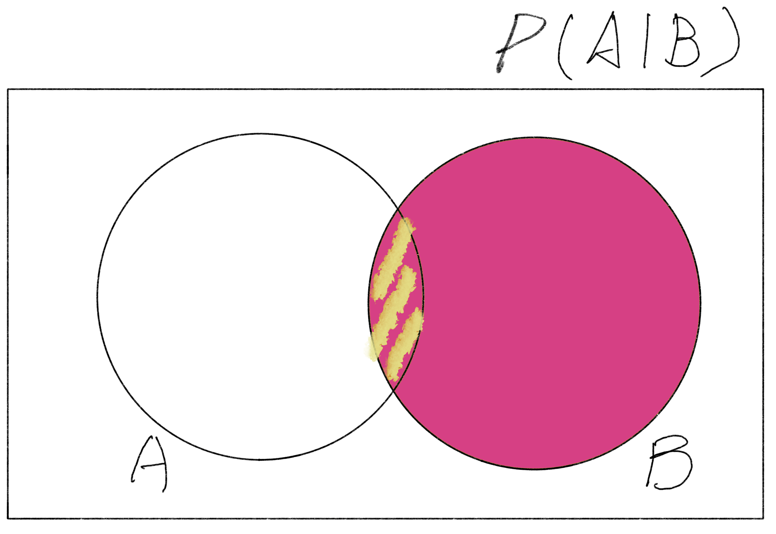
$P(A|B)$ is the probability of event A occurring given that event B has occurred. With reference to the below Venn Diagram, the explanation could be simplified to the probability of the intersection $P(A\cap B)$ divided by the probability of event B $P(B)$.

Venn Diagram of P(A|B)
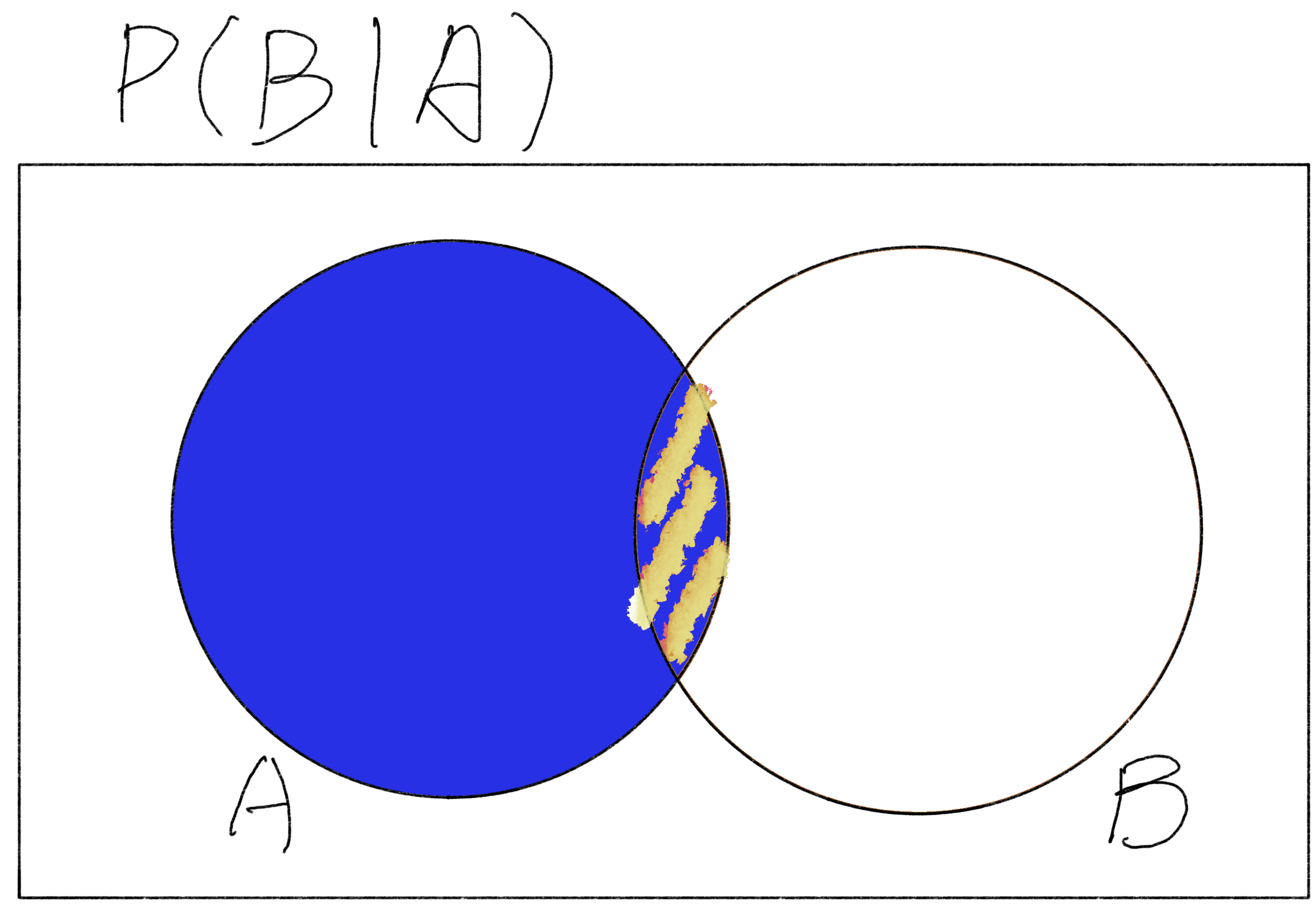
The same method applies to $P(B|A)$, that the probability of it is equivalent to the probability of the intersection $P(B\cap A) \text{ (which is equal to } P(A\cap B)\text{)}$ divided by the probability of event A ($P(A)$).

Venn Diagram of P(B|A)
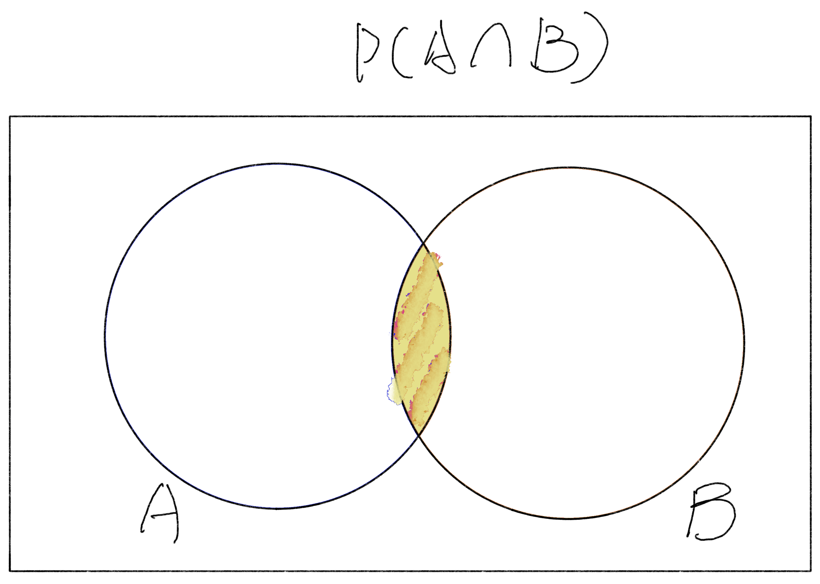
By visualizing Bayes’ Formula with the Venn Diagram, we can easily grasp that the $P(A\cap B)$ is actually the centerpiece of the entire Bayes’ Formula. And, the whole thing that Bayes’ Formula is trying to figure out the probability of a defined cause (event A) given the observed effect (event B). In other words, it is actually calculating the probability of the intersection $P(A\cap B)$ under the occurrence of event A $P(A)$ by using the probability of the occurrence of event B $P(B)$.

The centerpiece of the probability of A intersects B
Let’s now step-by-step derive the Bayes’ Formula to see the details behind the curtain.

Putting three diagrams in one chart
Conclusion
Understanding Bayes’ Theorem doesn’t have to be a daunting task filled with complex jargon and intimidating formulas. By breaking it down with simple visual aids like Venn diagrams, we can see that it’s all about finding the probability of one event given the occurrence of another. The key takeaway is that Bayes’ Theorem helps us update our beliefs based on new information, making it a powerful tool in many fields, from medicine to machine learning.
Hope this helps.


