Phew! With all the hard work of fetching data, processing factors, splitting training and testing datasets, selecting the right model to train, you finally have your machine learning model trained and be able to test how powerful it is. You’re very excited to feed a bunch of test data and got a 100%+ rate of return. What a success! But be careful, rate of return is not the sole factor to evaluate the quality of your trading strategy. There are other metrics that help you to understand the strengths and weaknesses of your trading strategy, and you can improve your trading behavior based on these metrics.
Here are a group of metrics that I would like to recommend to you as I’ve calculated and adopted them in my own quantitative trading projects. These metrics are objective enough for you to evaluate the quality of your strategy, and they are relatively easy enough to calculate in your own framework. So, bear with me and hear me out.
Previous reading:
General Characteristics of your strategy
- Average Capacity is the maximum number of stocks that you would like to be included in your portfolio. This is actually not a metric to evaluate the quality of your performance, but it’s very likely to influence the performance of your strategy, considering holding more stocks in your portfolio potentially increases the diversity.
- Average AUM stands for Asset Under Management. This indicates how much money is currently available for trading stocks.
- Average holding period could range from minutes to years, depending on the nature of your trading strategy and on the observing window length. If your strategy is observing daily MACD cross, the minimum average holding period of your strategy is 1 day.
Performance-related metrics
- Annualized rate of return is the most common metric to evaluate your strategy. It’s an obvious decision to make to choose between a strategy that produces 30% and a strategy that makes 300% annually. However, how do we prioritize the strategies that one makes 30% and the other one makes 33%? There we need other metrics to come into play to help us differentiate good and bad strategies.
- Win rate. Simple as that. It means how many trades made you profit among all the trades you made.
Risk related metrics
- Annualized volatility is a traditional method to evaluate the risk of your portfolio. This essentially evaluated how volatile your portfolio value was. The higher the volatility, the more likely your portfolio value will be influenced by the market or the macroeconomic. This risk can be mitigated by adding stocks from different industries to diversify your portfolio.
- Max Drawdown indicates the maximum percentage loss during the observation periods.
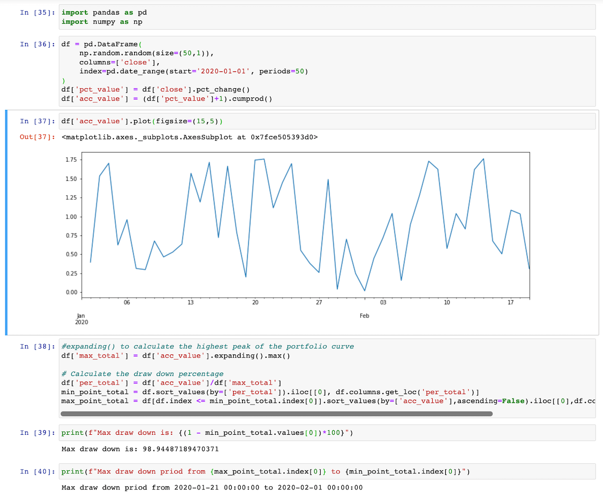
Code snippet to calculate the Max Drawdown
Efficiency related metrics
- Sharpe Ratio‘s calculation is relatively easy as dividing the portfolio excess return by the standard deviation of the portfolio excess return. However, it is probably the first metric you’re going to look at when evaluating the strategy. It stands for the excess return that you’re going to get by taking each unit of risk, which is volatility.$\text{where Portfolio’s excess return} = \text{Portfolio return} - \text{Risk-free rate}$
- Information Ratio is similar to the Sharpe ratio, but it is used to evaluate the ability to outperform the selected benchmark.
- Sortino Ratio is a variant of the Sharpe ratio. It evaluates the portfolio’s return given solely the downside risk, as the upside volatility is beneficial and we don’t worry about the upside volatility.
- Calmar Ratio is a useful way to evaluate the portfolio return against the maximum risk within the given time period. If the maximum drawdown is huge, you will get a relatively small Calmar ratio. This could potentially mean that your portfolio is relatively vulnerable when black swan incidents.
- Probabilistic Sharpe Ratio (PSR) is kind of an improvement version of the Sharpe ratio based on the statistical theory. Instead of calculating the Sharpe ratio using the given time series of return, PSR uses the skewness and kurtosis to generate an estimated normal distribution of the rate of return. Therefore, you are able to know the probability of your portfolio getting the estimated rate of return. You can check here for more details.
![]()
Code snippet to calculate the PSR

Classification scores (Machine learning strategy specific)
- Accuracy is the ratio of correctly predicted positive observations to the total positive observations.
- Precision is the ratio of correctly predicted positive observation and total predicted positive observation. It shows how precise our model is.
- Recall is the ratio of the correct predicted positive observation and the total observation in the class.
- F1-Score is the weighted average of recall and precision.
- AUC(Area Under roc Curve) is a metric that represents the classification ability of a machine learning model. An excellent model has AUC near to the 1 which means it has a good measure of separability. A model has an AUC near 0 which means it predicts the positive as the negative and vice versa. But it doesn’t necessary mean this model is poor. It still tells us that this model is able to separate the right and wrong samples. If a model has AUC equal to 0.5, that means this model is useless as it has no ability to predict the outcome. See more details here
- Matthews correlation coefficient (MCC) is a relatively general measure of “accuracy” of a predictive model that can give insights about how much we can rely on the model.
- Average return from hits is the average rate of return from bets that generate profit.
- Average return from misses is the average rate of return from bets that generate loss.
Others metrics
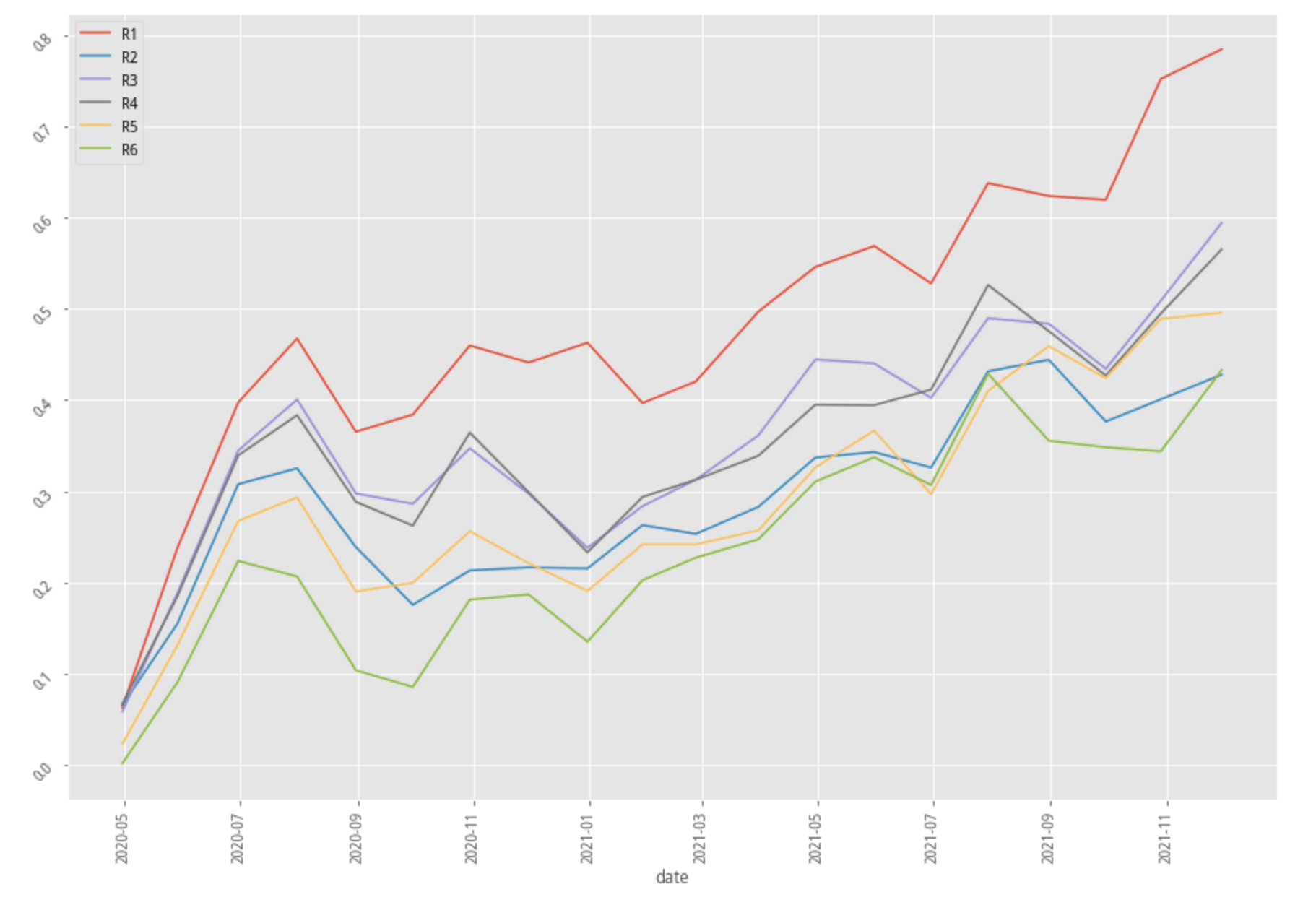
- Stratified Analysis to me is avery important steps in my research process. It tells me whether my model is capable of picking the stocks that have the highest return among all stocks.
![]()
Stratified analysis diagram
1 | group_number = 6 |
Code snippet to generate stratified analysis diagram
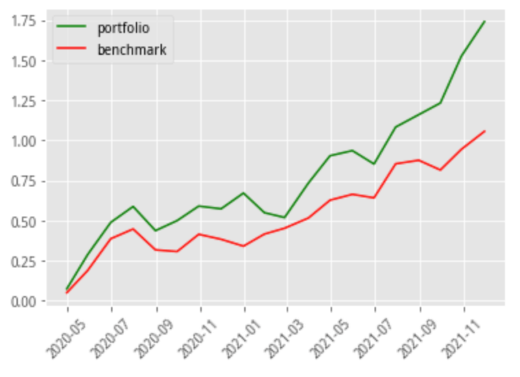
Benchmark performance diagram is simply to put your portfolio return on the chart against your selected benchmark return. In fact, there are a lot of things that can be found in this comparison. It tells whether you’re portfolio still grows when the benchmark return decline, whether your portfolio can grow faster in the bull market period, and many other things.
![]()
Portfolio return v.s. benchmark return
PnL is the profit and loss during the entire observation period.
- Turnover fee is the sum of the transaction fees that costs you while trading with this strategy. If you’re trading too frequently, your profit could be offset by this seemingly insignificant cost. The turnover fee could be calculated by the product of the number of total trades and the transaction fees per trade.
- Beta and Alpha both derive from the CAPM model. Alpha stands for the excess return of your strategy, and beta represents the systematic return.
These are the metrics that I’ve been using while evaluating my trading strategy. Please do tell me what other metrics you think are useful.